The Great American Coffee Taste Test

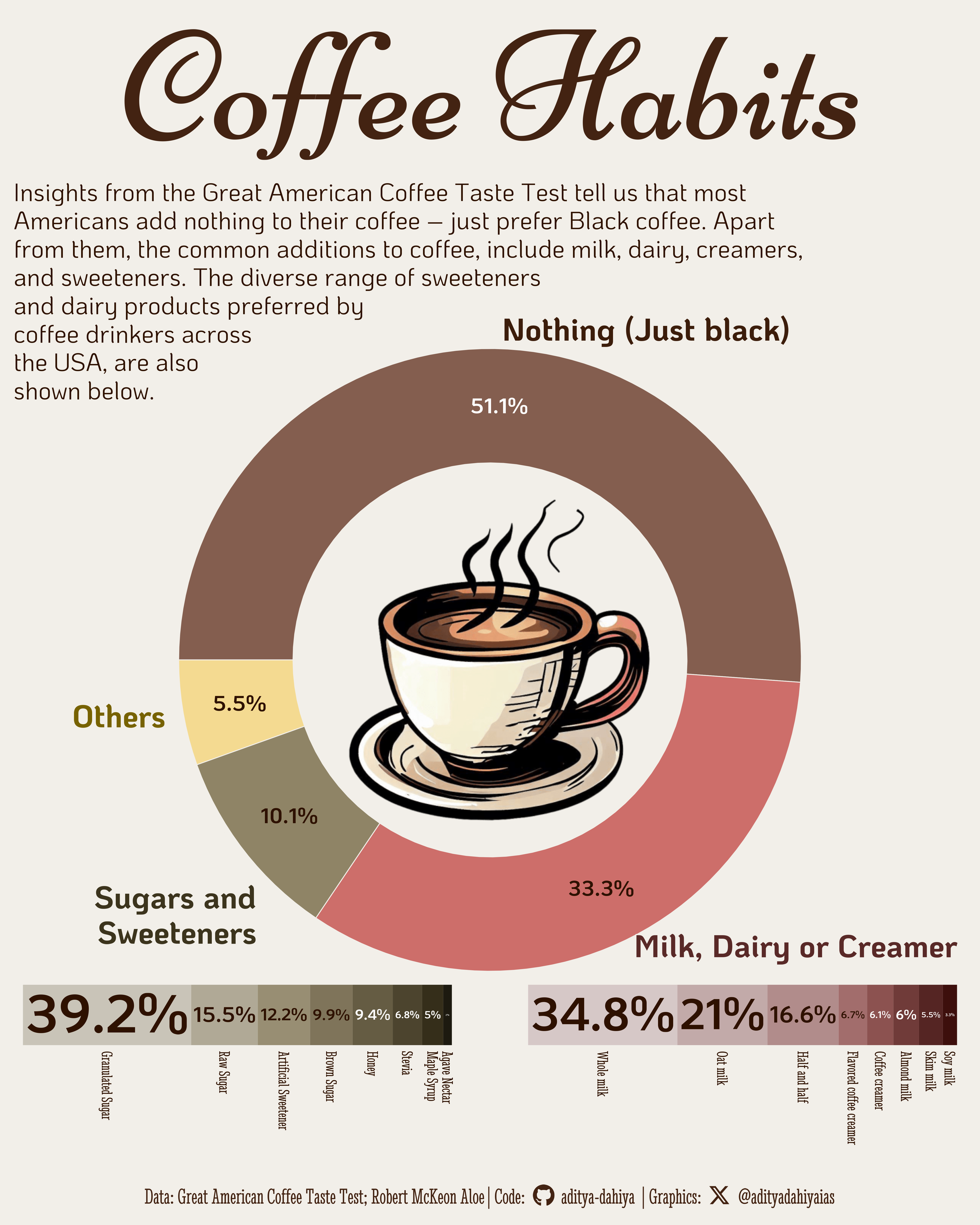
Preferred additions to Coffee in the survey of American coffee drinkers

#TidyTuesday
Donut Chart
Author

Aditya Dahiya

Published

May 15, 2024

The Great American Coffee Taste Test

In October 2023, James Hoffmann, along with coffee company Cometeer, conducted the “Great American Coffee Taste Test” via a livestream on YouTube, engaging approximately 4,000 participants across the USA. During the event, participants received four coffee samples from Cometeer without labels, brewing and tasting them while recording their notes and preferences. The survey data from this event was later analyzed by data blogger Robert McKeon Aloe, who delved into the rich demographics and coffee-related questions provided by the participants. However, it’s important to note that this data is voluntary and doesn’t encompass all participants’ responses due to incomplete surveys. Additionally, the dataset represents a sample of James Hoffmann’s fanbase, limiting its generalizability.

Insights from the Great American Coffee Taste Test tell is that most Americans add nothing to their coffee – just prefer Black coffee. Apart from them, the common additions to coffee, include milk, dairy, creamers, and sweeteners. The diverse range of sweeteners and dairy products preferred by coffee drinkers across the USA, are also shown.

Insights from the Great American Coffee Taste Test tell is that most Americans add nothing to their coffee – just prefer Black coffee. Apart from them, the common additions to coffee, include milk, dairy, creamers, and sweeteners. The diverse range of sweeteners and dairy products preferred by coffee drinkers across the USA, are also shown.

How I made this graphic?

Loading required libraries, data import & creating custom functions

Code
# Data Import and Wrangling Tools
library(tidyverse)            # All things tidy

# Final plot tools
library(scales)               # Nice Scales for ggplot2
library(fontawesome)          # Icons display in ggplot2
library(ggtext)               # Markdown text support for ggplot2
library(showtext)             # Display fonts in ggplot2
library(colorspace)           # Lighten and Darken colours
library(patchwork)            # Combining plots

# Extras and Annotations
library(magick)               # Image processing
library(ggfittext)            # Fitting labels inside bar plots
 
# Load Data
coffee_survey <- readr::read_csv('https://raw.githubusercontent.com/rfordatascience/tidytuesday/master/data/2024/2024-05-14/coffee_survey.csv')

Exploratory Data Analysis & Data Wrangling

Code
# Examine the available variables
# coffee_survey |> names()

# Additives to coffee
df1 <- coffee_survey |> 
  count(additions, sort = T) |> 
  uncount(weights = n) |> 
  separate_longer_delim(additions, delim = ", ") |> 
  count(additions, sort = T) |> 
  filter(!(additions %in% c("dairy alternative", "or coffee creamer"))) |> 
  drop_na() |> 
  mutate(additions = case_when(
    additions == "Milk" ~ "Milk, Dairy or Creamer",
    additions == "Sugar or sweetener" ~ "Sugars and\nSweeteners",
    additions == "No - just black" ~ "Nothing (Just black)",
    .default = "Others"
  )) |> 
  count(additions, wt = n, sort = T)
df1 <- df1 |>  
  mutate(additions = fct(additions, levels = df1$additions )) |> 
  mutate(perc = paste0(round(100 * n / sum(n), 1), "%") )

# Dairy additives to coffee
df2 <- coffee_survey |>
  count(dairy, sort = T) |> 
  drop_na() |> 
  uncount(weights = n) |> 
  separate_longer_delim(dairy, delim = ", ") |> 
  count(dairy, sort = T)
df2 <- df2 |> 
  mutate(dairy = fct(dairy, levels = df2$dairy)) |> 
  mutate(perc = paste0(round(100 * n / sum(n), 1), "%") )

# Sweetener Additives to coffee
df3 <- coffee_survey |> 
  count(sweetener, sort = T) |> 
  drop_na() |> 
  uncount(weights = n) |> 
  separate_longer_delim(sweetener, ", ") |> 
  count(sweetener, sort = T) |> 
  filter(!(sweetener == "Splenda)")) |> 
  mutate(sweetener = case_when(
    sweetener == "Raw Sugar (Turbinado)" ~ "Raw Sugar",
    sweetener == "Artificial Sweeteners (e.g." ~ "Artificial Sweetener",
    .default = sweetener
  ))
df3 <- df3 |> 
  mutate(sweetener = fct(sweetener, levels = df3$sweetener)) |> 
  mutate(perc = paste0(round(100 * n / sum(n), 1), "%") )

Visualization Parameters

Code
# Font for titles
font_add_google("Niconne",
  family = "title_font"
) 

# Font for the caption
font_add_google("Stint Ultra Condensed",
  family = "caption_font"
) 

# Font for plot text
font_add_google("KoHo",
  family = "body_font"
) 

ts <- 80

showtext_auto()

bg_col <- "#F2EFE9"
# Credits for coffeee palette
coffee_pal <- c("#623C2B", "#AF524E", "#736849", "#EBD188")

text_col <-  coffee_pal[1] |> darken(0.7)
text_hil <-  coffee_pal[1] |> darken(0.4)

# Palettes for inset graphs

n2 <- 0.1 * 1:nrow(df2)
n2 <- n2 - median(n2)

pal2 <- vector()
for (i in 1:nrow(df2)){
  pal2[i] <- darken(coffee_pal[2], n2[i], method = "absolute")
}

n3 <- 0.1 * 1:nrow(df3)
n3 <- n3 - median(n3)

pal3 <- vector()
for (i in 1:nrow(df3)){
  pal3[i] <- darken(coffee_pal[3], n3[i], method = "absolute")
}

# Caption stuff for the plot
sysfonts::font_add(
  family = "Font Awesome 6 Brands",
  regular = here::here("docs", "Font Awesome 6 Brands-Regular-400.otf")
)
github <- "&#xf09b"
github_username <- "aditya-dahiya"
xtwitter <- "&#xe61b"
xtwitter_username <- "@adityadahiyaias"
social_caption_1 <- glue::glue("<span style='font-family:\"Font Awesome 6 Brands\";'>{github};</span> <span style='color: {text_hil}'>{github_username}  </span>")
social_caption_2 <- glue::glue("<span style='font-family:\"Font Awesome 6 Brands\";'>{xtwitter};</span> <span style='color: {text_hil}'>{xtwitter_username}</span>")

Annotation Text for the Plot

Code
plot_title <- "Coffee Habits"

plot_caption <- paste0(
  "Data: Great American Coffee Taste Test; Robert McKeon Aloe", 
  " |  **Code:** ", 
  social_caption_1, 
  " |  **Graphics:** ", 
  social_caption_2
  )

plot_subtitle <- str_wrap("Insights from the Great American Coffee Taste Test tell is that most Americans add nothing to their coffee – just prefer Black coffee. Apart from them, the common additions to coffee, include milk, dairy, creamers, and sweeteners. The diverse range of sweeteners and dairy products preferred by coffee drinkers across the USA, are also shown below.", 100)

# Custom line-breaks (done in MS Word)
plot_subtitle <- "Insights from the Great American Coffee Taste Test tell us that most\nAmericans add nothing to their coffee – just prefer Black coffee. Apart\nfrom them, the common additions to coffee, include milk, dairy, creamers,\nand sweeteners. The diverse range of sweeteners\nand dairy products preferred by\ncoffee drinkers across\nthe USA, are also\nshown below."

str_view(plot_subtitle)

Image Annotation (Credits: Icon Archive)

Code
img_url <- "https://icons.iconarchive.com/icons/iconarchive/fat-sugar-food/512/Drink-Coffee-icon.png"

library(magick)

img1 <- image_read(img_url) |> 
  image_background("transparent")

# Make image a ggplot2 object to use with patchwork
inset1 <- ggplot() +
  annotation_custom(
    grob = grid::rasterGrob(img1),
    xmin = 0, xmax = 1,
    ymin = 0, ymax = 1
  ) +
  theme_void()

# Extracted Colour palette
# set.seed(42)
# img1_palette <- img_url |> 
#   colorfindr::get_colors() |> 
#   colorfindr::make_palette(n = 6)
# colpal <- c("#F6EFD3", "#D3BEA7", "#482B20", "#E9B486")
# 
# text_col <-  darken("#6B4533", 0.4)
# text_hil <-  "#6B4533"

The Base Plot - Donut Chart

Code
p1 <- df1 |> 
  ggplot(
    mapping = aes(
      x = 1,
      y = n,
      group = additions,
      fill = additions
    )
  ) +
  # Donut Chart
  geom_col(
    colour = bg_col,
    position = position_stack(vjust = 0.5)
  ) +
  scale_fill_manual(values = coffee_pal |> lighten(0.2)) +
  
  # Adding Percentage markers within donut chart
  geom_text(
    mapping = aes(
      label = perc,
      colour = (additions == "Nothing (Just black)")
    ),
    position = position_stack(vjust = 0.5),
    family = "body_font",
    size = ts / 3,
    lineheight = 0.35,
    fontface = "bold"
  ) +
  scale_colour_manual(values = c(text_col, "white")) +
  
  # Adding labels around the donut chart
  ggnewscale::new_scale_colour() +
  geom_text(
    mapping = aes(
      x = 1.6,
      label = additions,
      colour = additions
    ),
    position = position_stack(vjust = 0.5),
    lineheight = 0.3,
    hjust = "outward",
    family = "body_font",
    size = ts / 2,
    fontface = "bold"
  ) +
  scale_colour_manual(values = c(darken(coffee_pal, 0.5), bg_col, bg_col)) +
  
  scale_y_continuous(expand = expansion(0)) +
  
  coord_polar(
    theta = "y", 
    start = 90 * pi/180,
    direction = -1) +
  xlim(c(-1, 2)) +
  
  # Labels for the plot
  labs(
    title = plot_title, 
    caption = plot_caption
  ) +
  theme_void(
    base_family = "body_font",
    base_size = ts
  ) +
  theme(
    legend.position = "none",
    plot.margin = margin(0,0,0,0),
    plot.title = element_text(
        size = 7 * ts,
        hjust = 0.5,
        colour = text_hil,
        family = "title_font",
        margin = margin(10,0,3,0, "mm")
      ),
    plot.subtitle = element_text(
        hjust = 0,
        lineheight = 0.35,
        size = ts,
        colour = text_col,
        family = "body_font",
        margin = margin(0,0,0,0, "mm")
      ),
    plot.caption = element_textbox(
        hjust = 0.5,
        family = "caption_font",
        size = ts,
        colour = text_hil,
        margin = margin(20 ,0,5,0, "mm")
      ),
    axis.ticks = element_blank(),
    axis.text = element_blank(),
    axis.title = element_blank(),
    panel.background = element_rect(
      fill = "transparent",
      colour = "transparent"
    ),
    plot.background = element_rect(
      fill = bg_col,
      colour = bg_col
    )
  )

Additional Stacked bar Charts & Annotations

Code
p2 <- df2 |> 
  ggplot(
    mapping = aes(
      x = 1,
      y = n,
      fill = dairy,
      group = dairy
    )
  ) +
  geom_col(
    position = position_stack(),
    width = 0.2
  ) +
  ggfittext::geom_fit_text(
    aes(
      label = perc,
      colour = (dairy %in% c("Coffee creamer", "Almond milk", 
                             "Skim milk", "Soy milk"))
    ), 
    position = position_stack(vjust = 0.5),
    angle = 0,
    family = "body_font",
    fontface = "bold",
    grow = TRUE,
    min.size = ts/10,
    padding.y = grid::unit(15, "mm")
    
  ) +
  scale_colour_manual(values = c(text_col, "white")) +
  geom_text(
    aes(
      label = dairy,
      x = 0.88
      ),
    position = position_stack(vjust = 0.5),
    hjust = 0,
    vjust = 0.5,
    angle = -90,
    family = "caption_font",
    colour = text_col,
    size = ts / 4
  ) +
  scale_y_reverse(expand = expansion(0.2)) +
  scale_x_continuous(expand = expansion(c(1, 0))) +
  scale_fill_manual(values = pal2) +
  coord_flip(clip = "off") +
  theme_void() +
  theme(
    legend.position = "none",
    plot.background = element_rect(
      fill = "transparent",
      colour = "transparent"
    ),
    panel.background = element_rect(
      fill = "transparent",
      colour = "transparent"
    )
  )

p3 <- df3 |> 
  ggplot(
    mapping = aes(
      x = 1,
      y = n,
      fill = sweetener,
      group = sweetener
    )
  ) +
  geom_col(
    position = position_stack(),
    width = 0.2
  ) +
  ggfittext::geom_fit_text(
    aes(
      label = perc,
      colour = (sweetener %in% c("Honey",
                             "Stevia",
                             "Maple Syrup",
                             "Agave Nectar"))
    ), 
    position = position_stack(vjust = 0.5),
    angle = 0,
    family = "body_font",
    fontface = "bold",
    min.size = ts/10,
    padding.y = grid::unit(15, "mm"),
    grow = TRUE
  ) +
  scale_colour_manual(values = c(text_col, "white")) +
  geom_text(
    aes(
      label = sweetener,
      x = 0.88
      ),
    position = position_stack(vjust = 0.5),
    hjust = 0,
    vjust = 0.5,
    angle = -90,
    family = "caption_font",
    colour = text_col,
    size = ts/4
  ) +
  scale_y_reverse(expand = expansion(0.2)) +
  scale_x_continuous(expand = expansion(c(1, 0))) +
  scale_fill_manual(values = pal3) +
  coord_flip(clip = "off") +
  theme_void() +
  theme(
    legend.position = "none",
    plot.background = element_rect(
      fill = "transparent",
      colour = "transparent"
    ),
    panel.background = element_rect(
      fill = "transparent",
      colour = "transparent"
    )
  )

p_subtitle <- ggplot() +
  annotate(
    geom = "text",
    x = 0, y = 0,
    hjust = 0,
    vjust = 1,
    label = plot_subtitle,
    family = "body_font",
    colour = text_col,
    lineheight = 0.3,
    size = ts / 2.5
  ) +
  theme_void() +
  theme(
    plot.background = element_rect(
      fill = "transparent",
      colour = "transparent"
    )
  )

Adding annotations to the plot

Code
g <- p1 +
  inset_element(
    p = inset1,
    on_top = TRUE,
    ignore_tag = TRUE,
    clip = FALSE,
    align_to = "panel",
    left = 0.32, right = 0.7,
    bottom = 0.3, top = 0.7
  ) +
  inset_element(
    p = p_subtitle,
    on_top = TRUE,
    ignore_tag = TRUE,
    clip = FALSE,
    align_to = "panel",
    left = -1,  right = 1,
    top = 1.3, bottom = 0.7
  ) +
  
  # Add stacked horizontal Bar Charts
  inset_element(
    p = p2,
    on_top = TRUE,
    clip = FALSE,
    align_to = "panel",
    left = 0.45, right = 1.08,
    top = 0.27,
    bottom = -0.3
  ) +
  
  inset_element(
    p = p3,
    on_top = TRUE,
    clip = FALSE,
    align_to = "panel",
    left = -0.08, right = 0.55,
    top = 0.27,
    bottom = -0.3
  ) +
  
  plot_annotation(
    theme = theme(
      plot.background = element_rect(
        fill = bg_col,
        colour = bg_col
      )
    )
  )

Savings the graphics

Code
ggsave(
  filename = here::here("data_vizs", "tidy_coffee_test.png"),
  plot = g,
  width = 400,    # Best Twitter Aspect Ratio = 4:5
  height = 500,   
  units = "mm",
  bg = bg_col
)

# Saving a thumbnail for the webpage
image_read(here::here("data_vizs", "tidy_coffee_test.png")) |> 
  image_resize(geometry = "400") |> 
  image_write(here::here("data_vizs", "thumbnails", "tidy_coffee_test.png"))