Why every Hong Kong MTR station is a different colour – the reason may surprise you
When Hong Kong’s mass transit railway lines were being built, it was decided the stations should be colourful to beautify them, and different colours were chosen to help travellers who couldn’t read identify them
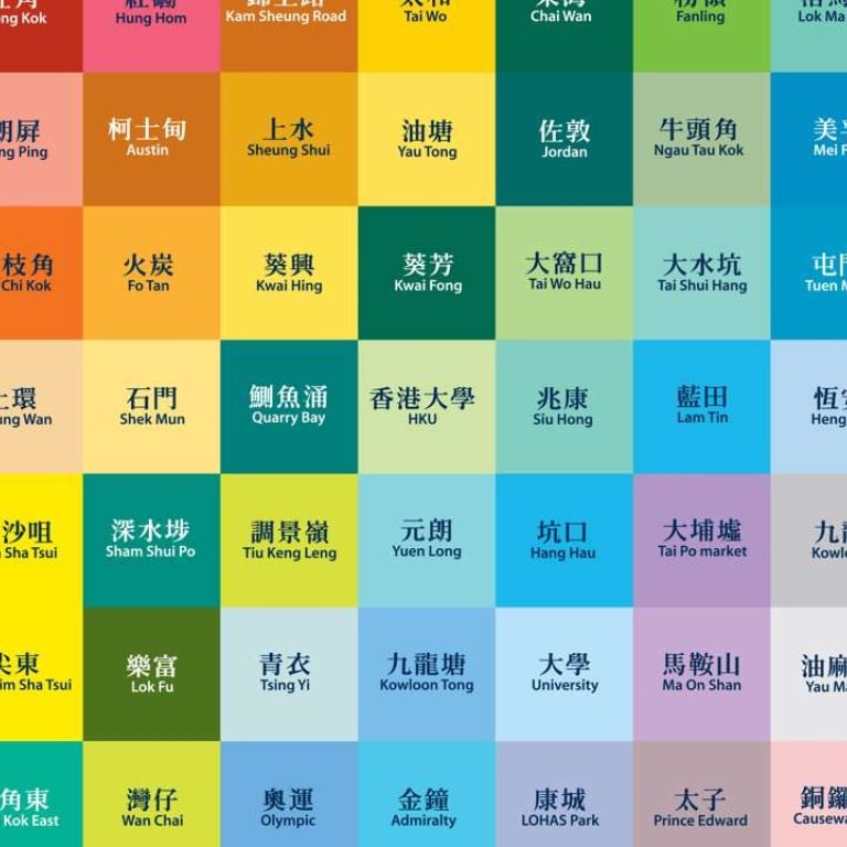
Mong Kok is red, Admiralty is blue, and no one passing through Choi Hung MTR station can fail to spot the rainbow-streaked pillars at the platform. You may think the vibrantly coloured tiled walls of Hong Kong’s mass transit railway system mirror the city’s energy, but that’s not why contrasting colours were chosen for its stations.
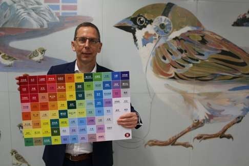
The main reason bright colours were adopted when the first line opened in the 1970s was to lighten up the subway system, according to Andrew Mead, the MTR Corporation’s chief architect. With no windows or natural light, underground platforms can be gloomy. Bright colours are associated with beauty, and they bring a dash of that to the mostly subterranean stations, he says.
The corporation could have chosen a neutral white design. But Mead says an important factor in picking different colours was function. Underground, where there are no landmarks to look out for like when you’re travelling by bus or car, colour helped differentiate the MTR stations, and gave each their own identity. That was important, Mead says, because “back in the 1970s, there was still a high level of illiteracy” in the city. It was not until 1971 that Hong Kong launched a programme of free compulsory education.
Watch: Meet the lady behind Hong Kong MTR announcements
“If you can’t read, either English or Chinese, how would you recognise a station?” The palette was therefore deliberately planned to help commuters navigate the network, says Mead, who worked for Singapore’s Land Transport Authority before joining the MTR Corp in February 2013.

As the railway system extended its tentacles, the colour coding became more pronounced.

In developing the colour coding, Mead says, the MTR Corp was careful to avoid using the same tone for successive stations. For instance, blue is the hue at Mei Foo, in sharp contrast to the red stations of Lai King and Lai Chi Kok.
However, it takes some lateral thinking to make sense of the colour used at a few of the platforms. Some were simply derived from the Chinese names of the stops. For example, the rainbow colours of Choi Hung station are a vivid example of the literal translation from Cantonese: choi hung means rainbow. Yellow is the colour of Wong Tai Sin station because the word wong means yellow. Lai Chi Kok station is a pinky red because lai chi means lychee. Prince Edward station is purple because it’s commonly associated with royalty in Britain, the city’s former colonial ruler.

Other stations were designed using colours that take into account the local environment.
“Whampoa station is blue because it’s close to the water. Ho Man Tin station is green because it’s a part of the hill, and that’s really how that colour was chosen. Nothing’s really more sophisticated than that, and this makes it distinctive,” Mead says.

So MTR architects decided to capitalise on this distinct colouring – or lack of it. “The Airport Express, Kowloon and Hong Kong stations are all the same grey,” Mead says. “As soon as you go to Kowloon station, as soon as you go to Hong Kong station, you feel like you are at the airport. It’s the extension of the airport from Lantau into the city.”
However, the Airport Express is not all grey. There are splashes of colour in works of art the
architects integrated into stations, blending colour and functionality.

Meanwhile, Mead says, a diverse collection of art has been added to older stations. That includes the chubby bronze ballerina sculptures by Chinese artist Yin Zhixin at Choi Hung station – one of the oldest. A brighter example is Ng Yuen-wa’s Life in Mei Foo – Now and Then, in Mei Foo station. Its 16 vividly painted panels depict the lives of the neighbourhood’s residents, enjoying the Mid-Autumn Festival, spending time in a park or just relaxing at home.
“These are all curated. It’s not just about picking a nice picture; it’s about making sure it resonates with the people going through,” Mead says.
For the newer stations, the MTR Corp is starting to integrate art and colour in a more sophisticated way, he says.

Such functional artwork and meaningful colours are integrated so seamlessly on the MTR, though, that you’d be forgiven for not noticing them.
