A Cooling Planet Means Price Inflation
Free Chart In Focus email
Delivered to you every week
It has not been a popular topic to report in the news media, but the data from the United Kingdom's Hadley Centre Climate Programme show that the Earth has been in a cooling trend since 1998. And that has profound implications for investors, as this week's chart reveals.
The HadCRUT4 temperature series is a new data set of global and regional temperature evolution from 1850 to the present. See this link for an abstract explaining this series. The raw data are available here.
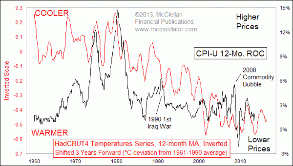
The point of this week's chart is to reveal how global cooling periods are associated with higher rates of Consumer Price Index (CPI) inflation rates. That's right: global cooling leads to higher consumer prices. The linkage is likely related to agriculture, since cooler climate periods lead to lower crop yields, driving up food prices and thus all sorts of other price series.
The HadCRUT4 data are reported monthly, and they are somewhat noisy. So to create this week's chart, I first smoothed that data with a 12-month simple moving average to soften some of that noise, and allow us to see the underlying trend. Then I inverted it to better correlate to the movements of the CPI-U's annual rate of change. Last, I shifted forward the inverted plot of temperature data by 3 years to reveal how the CPI tends to follow in those same footsteps with about a 3-year lag.
The temperature data do not perfectly explain all of the movements of the CPI, which is not surprising. Other factors can have a big effect, especially when governmental forces like war and extreme Fed action put a thumb on the scale. In 1990, for example, oil prices spiked from $20/barrel up to $40 when Iraq invaded Kuwait, and that naturally bent the inflation rate higher. Once that war was successfully resolved, prices got back on track.
In a similar way, the 2008 commodity bubble caused oil prices to spike up to $145/barrel in July 2008, and then crash back down to $35 in December 2008. That move cannot be attributed to the climate data, but the high and low extremes canceled each other out and since then the data have correlated nicely.
The last time that Earth went through a big cooling period was in the 1960s and 1970s. 1976 saw an average temperature deviation 0.24°C below the 1961-1990 average, which marked a trough for global temperatures. It is shown as a peak for the plot on the chart, since I have inverted the scaling. And true to form, the inflation rate saw its peak just over 3 years later in early 1980. The global warming period of the 1980s and 1990s correlated nicely with the decrease in the inflation rate, down to even monthly granularity once we factor in that 3-year lag period.
The trouble for us now is that the current cooling trend might continue, or even accelerate. That would imply a rise for the inflation rate. And there is evidence from other data that this cooling trend is already underway. The current sunspot cycle has been remarkably weak, indicating a downturn in overall solar energy output similar to other solar minima in history.
In a January 2013 article, Dr. Tony Phillips, production editor of Science@NASA, noted: "Indeed, the sun could be on the threshold of a mini-Maunder event right now. Ongoing Solar Cycle 24 is the weakest in more than 50 years."
The “Maunder event” which Phillips was referring to is the so-called Maunder Minimum, which resulted in very low numbers of observed sunspots in the late 1600s. Named for solar astronomer Edward W. Maunder, that solar minimum coincided with a period of lower than average European temperatures. The inflationary pricing pressures associated with the Maunder Minimum were part of the economic environment which led to the Glorious Revolution in Great Britain in the late 1680s.
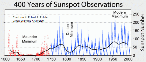
Chart accessed from http://en.wikipedia.org/wiki/File:Sunspot_Numbers.png
A weaker solar minimum was the Dalton Minimum from about 1790 to 1820. It was still enough of a drop in solar activity to bring famine and severely cold winters. Napoleon Bonaparte learned that the hard way in 1812 in Russia.
A less severe solar minimum came in the late 1800s, still well before the creation of the Consumer Price Index. So while we do not have a good quantitative measure of its inflationary effect, we know from the history of the bimetallism movement of the late 1800s http://www.econlib.org/library/YPDBooks/Laughlin/lghHBM.html and William Jennings Bryan’s 1896 “Cross of Gold” speech that there was tremendous inflationary pressure then. http://historymatters.gmu.edu/d/5354/
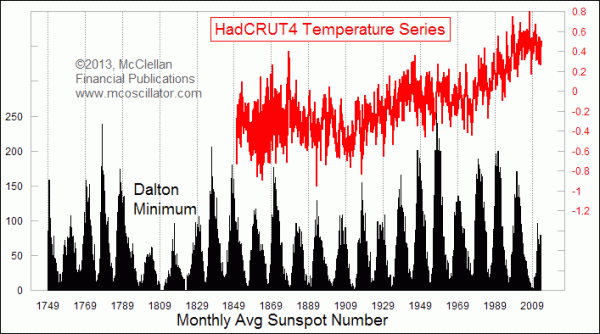
We can see in the HadCRUT4 data series that the sunspot minimum in the late 1800s did bring a downturn in global temperatures, ending in the 1910s. The “Roaring 20s” and the associated economic boom came as temperatures started warming again with the higher sunspot numbers of sunspot cycle #15.
Coming back to what this all means for us now, if the current sunspot cycle remains quiet, then the current cooling period would be expected to continue. Solar scientists uniformly agree that there is no good way (yet) to make long term forecasts of sunspot cycle intensity, but the possibility exists that we are seeing a natural cyclic phenomenon in solar variation. Given the strong correlation we have seen over the past 100 years between global average temperatures and the inflation rate, it just may be that this cyclical phenomenon on solar variation just might explain the 60-year cycle in interest rates.
So if global temperatures do indeed trend lower, we can reasonably expect inflation rates to trend higher, after the 3-year lag is accounted for. And with those higher inflation rates come higher interest rates, as the 60-year cycle calls for.
Tom McClellan
Editor, The McClellan Market Report
Aug 27, 2010
60-year Cycle In Interest Rates |
Jul 25, 2013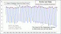
Is Shrinking Arctic Ice a Bad Thing? |
Jul 27, 2012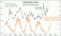
The Real Cause of Higher Grain Prices |
Dec 23, 2011
Are Traders Really Just Driven By the Sun? |