Two polar approaches have emerged. On the one hand, people like Alkire and Foster (2011) propose using scalar indices to combine information on various dimensions of poverty in a single number. Countries such as Mexico –in 2009- and Colombia –in 2011- and international institutions such as the UNDP in 2010, have chosen to adopt such multidimensional poverty indices to assess progress. The big attraction of these indices is not just that they consider multiple indicators, but that they take into account, to some extent, how the dimensions relate to each other -- e.g. whether income poverty and poor health afflict the same people or not.
On the other hand, Ravallion (2011) advocates a ‘dashboard approach’ that makes use of the best available data for each dimension. This approach avoids imposing arbitrary weights to each dimension. (Is health more or less important than education? Should statisticians really be making that choice?) The drawback is that the dashboard ignores the inter-connections between dimensions.
We argue that this “single index versus dashboard” debate is premised on a false dichotomy. The really interesting thing about studying the many dimensions of poverty is how they interrelate: how many people are exposed to which deprivations, or combinations of deprivations, and to what extent. Fortunately, understanding those inter-relationships does not require imposing arbitrary weights to construct a single, ‘mash-up’ index. There are at least two alternative approaches in the literature that allow you to have your multidimensional cake and eat it too:
- Multivariate stochastic dominance (MSD) techniques proposed by Duclos, Sahn and Younger (2006). This set of techniques is based on comparing surfaces of joint distribution functions – like you would obtain if you plotted the percentage of people with fewer than x dollars of annual income and y years of life expectancy on a three-dimensional surface. In the case of a single dimension, whenever distribution A lies everywhere above distribution B, stochastic dominance allows us to reach a robust conclusion: group A is poorer than group B no matter where we draw the poverty line. Similarly, MSD would imply that group A is poorer than group B no matter where we draw the poverty line, and no matter how we weight the various dimensions of well-being.
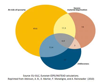
- Dashboard plus Venn diagrams: This is likely the simplest approach, as it consists merely of a graphical representation of how the sets of people considered deprived along each dimension overlap. The larger the overlap between deprivations, the greater is the extent of interdependence. Atkinson and co-authors (2010, see chapter 5) use this approach for the European Union-27 countries.
Drawn from that chapter, Figure 2 below shows the number of people that are at risk of poverty (EU definition), the number of people that are materially deprived, and the number of people aged 0-59 living in `jobless’ households. The authors conclude that not only is it important to monitor the three indicators, but that understanding the degree of overlap will also help shape policies to address these shortfalls.
Figure 2. Multiple indicators from the Europe 2020 target. Figures for EU-27 in million of persons
A third alternative --dashboard + copula—is discussed in our paper, although this is particularly relevant when the objective is to evaluate well-being rather than deprivations.
Although they differ in technical complexity, these three alternative techniques would seem to avoid the disadvantages associated with both the scalar indices and the dashboard approach. Like the dashboard approach (but unlike scalar indices), they dispense with arbitrary weights – and their unpalatable implications in terms of trade-offs - to aggregate across dimensions. Like scalar indices (but unlike the dashboard approach) they incorporate information about how the deprivations are jointly distributed and allow analysts to take into account different levels or changes in the extent of overlap or correlation between them. This is a menu of analytical approaches that represent an advantageous middle ground in multidimensional poverty analysis, and which might add value to some of the poverty analysis currently undertaken at the World Bank (and beyond).
This blog post largely draws from the WB Policy Research Working Paper 5964 (February, 2012), of the same title.


Join the Conversation