In June of this year, we marked the fourth anniversary of the official end of the Great Recession as determined by the National Bureau of Economic Research (NBER). I've intentionally selected the word "marked" over the more optimistic celebrated" after reading the stunning report just released by Sentier Research: Household Income On the Fourth Anniversary of the Economic Recovery: June 2009 to June 2013. The press release in PDF format is available here at the Sentier Research website. The full report, 27 pages of richly detailed data on median household incomes, is available for a modest fee here, and I highly recommended a close study of the full report for anyone with a keen interest in the demographics of the U.S. economy.
The press release opens with the initial stunner, one which comes as no surprise to those of us who follow the monthly Sentier Research updates:
| Based on new estimates derived from the monthly Current Population Survey (CPS), real median annual household income, while recovering somewhat from the low-point reached in August 2011, has fallen by 4.4 percent since the "economic recovery" began in June 2009. Adding this post-recession decline to the 1.8-percent drop that occurred during the recession leaves median annual household income now 6.1 percent below the December 2007 level. |
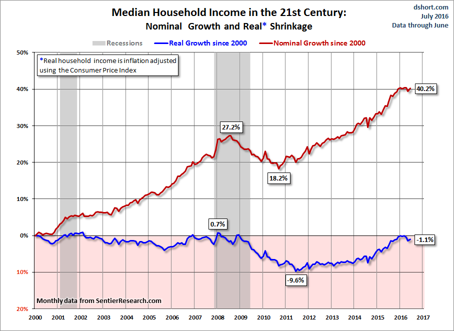
Before we dig into the new findings, let's have a quick look at an overlay of nominal and real (inflation adjusted) median household incomes since the turn of the century based on Sentier Research's monthly reports of the real, seasonally adjusted data:
Additional charts and a discussion of this 13-year timeframe are available at this permanent link, which I update monthly.
Today's new report from the company includes breakdowns of the median data in multiple ways: by type of household, age of householders, employment status of householders, number of earners, race and ethnicity, education and much more.
In this commentary I'll focus on two of these broad areas: age and race/ethnicity. In follow-up commentaries, I'll explore some of the other findings.
The Breakdown by the Age of the Householder
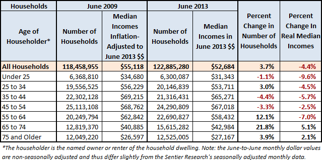
The first table below gives us two snapshots in time (June 2009 and June 2013) of all households and seven constituent age cohorts -- under 25, 75 and over, and the five 10-year cohorts in between. The two rightmost columns show the percent change in 1) the number of households per cohort and 2) the real (inflation-adjusted) median incomes of the cohorts. The incomes for 2009 have been adjusted for inflation using the Consumer Price Index.
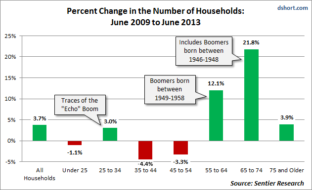
The column chart below highlights the rather dramatic impact of the Baby Boom generation entering the 55-64 and 64-65 cohorts. We also see the substantially smaller imprint of the Echo Boom.
The columns above are further illuminated by a look at the ratio of births to the total population during the last century.
As we saw in the table above, the real median income for all households has shrunk 4.4% since the end of the recession. As the next set of columns shows us, three of the age cohorts have fared statistically worse than the "all households" category, and three have fared better -- although only the two oldest cohorts have experienced growth.
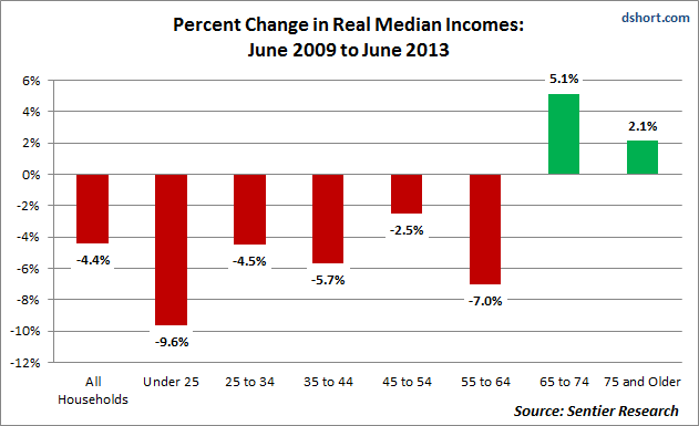
The "Under 25" group has suffered the most shrinkage, a topic I'll look at more closely in a follow-up commentary where we'll look at important trends in part-time employment and accelerated efforts by many people to improve their human capital through education. The 25 to 35 cohort is not statistically different from the 4.4% "All Households" decline. The 45 to 50 cohort, which has historically been the peak earning years (more on that topic here), has also seen a real income decline, but less severe than that of the total population. The two "elderly" cohorts, a term I use respectfully as a youngster in this rapidly growing population, are the only two to show growth, with the 65 to 74 age group as the standouts. What we're seeing in both of the older groups is largely the result of two things:
- The positive impact of pensions and especially Social Security, which has had cost of living adjustments (COLAs) since 1975 with only two exceptions -- namely the first two deflationary calendar years of our June 2009-June 2003 focus.
- The well-documented trend toward working longer for the 65 and over crowd. As I've discussed in more detail here, approximately one in three of the 65-69 cohort is still in the labor force as is approximately one in five of the 70-74 cohort.
The Breakdown by Race and Ethnicity
The next table compares the households by race and ethnicity at the end of the Great Recession with the statistics four years later. As in the table above, the two rightmost columns document the change in the number of households and the change in real median household incomes for the cohorts.
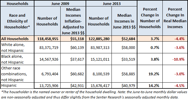
A column chart shows the remarkable growth of two categories: "Other Race Combinations, Not Hispanic" and "Hispanic".
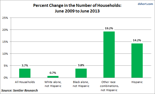
Although the chart above shows the comparative growth, it doesn't reveal the relative dimensions of the four categories within the overall household population. A pair of pie charts provides a telling visualization of the change over the four-year period relative to total population growth. To one decimal place, Black households make up the same percentage of total households at 12.3% In fact, had I calculated two decimals there would be no change at 12.30%. Hispanic households have now fractionally overtaken Black households as the second largest group. Despite its greater growth, the "Other Combinations, Not Hispanic" category, which includes Asians, remains the smallest, at slightly more than half the number of the Hispanic households.

The Disturbing Race and Ethnic Divide
The next chart illustrates the deeply disturbing decline in the real median income for black households, which have seen a 10.9% drop in real household incomes since the end of the recession. Hispanic household incomes have also slipped but, by a percentage that is statistically no different from the "All Households" number.
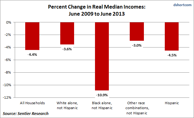
The chart above is all the more disturbing when we look at the real household incomes themselves. In June 2009 the median annual income for Black households was 31.8% lower than the total median household income. Four years later the gap has widened to 36.4%. For Hispanic households, the 22.1% gap from all households in June 2009 is essentially unchanged four years later at 22.2%.
The findings of Sentier Research in the area of Race and Ethnicity come exactly one week before President Obama will mark the 50th anniversary of Martin Luther King's "I Have a Dream" speech (more here). The President is expected to focus new attention on civil rights and racial prejudice. Among the many topics he might address (voter registration, racial profiling, courtroom justice, etc.), the growing financial inequality among households is one that will resonate with anyone who has studied the data.
In another commentary I'll explore additional aspects of Sentier Research's blockbuster report, including household composition and education.
