Trends in income inequality are at the center of development policy discussions these days. Part of this renewed attention is no doubt a tribute to Thomas Piketty’s
pioneering work to measure top income shares using income tax data, as well as his much-discussed
new book. Piketty’s work shows some dramatic trends in inequality at the top end of the income distribution. For example, in countries such as China, Singapore, and the United States, the share of income earned by the top 10% has increased by more than 10 percentage points over the past 30 years.
How much do these trends in inequality at the top end of the income distribution matter? While there are many channels through which inequality may affect economic outcomes, a useful first step is to go back to basics and consider the implication of changes in top income shares for changes in social welfare. Economists have long relied on social welfare functions as tools for describing preferences for how income is distributed across individuals in a society. Roughly speaking, social welfare functions are weighted averages of individuals’ incomes, with weights that reflects societal preferences for equity. A common social welfare function first introduced by Atkinson (1970) is

where Yi and si are the average income and population share of group i, and a>0 is a parameter capturing social preferences for equity. Higher values of a place more weight on lower incomes, and so correspond to greater preferences for equity.
Piketty’s data includes the income shares of the top 90%, 95%, 99%, 99.5% and 99.9% percent for many countries, so this gives us six groups over which to calculate social welfare. While there are many different possible values of a that could be used, a useful starting point is to consider the case of extreme inequality aversion, i.e. a is arbitrarily large. In this case all the weight in the social welfare function is assigned to the poorest group, i.e. the social welfare function reflects only average incomes in the bottom 90% of the income distribution, and discounts entirely the incomes of the richest 10%. This in turn implies that social welfare would be unchanged if all of the income of the top 10 percent were taken away and none of it were redistributed to the bottom 90%. While this is of course unrealistic, it is a useful benchmark because it sets an upper bound on the importance that the social welfare function assigns to inequality at the high end of the income distribution.
Growth in social welfare can be decomposed into growth in average incomes, and growth in a particular measure of inequality – in this case, the income share of the bottom 90%. If the income share of the top 10% is rising, the share of the bottom 90% is falling and social welfare increases more slowly than average incomes. On the other hand, if the income share of the top 10% is falling, the income share of the bottom 90% is increasing and social welfare grows faster than average incomes. The difference between the growth rate of social welfare and the growth rate of average income can be interpreted as the welfare loss (or gain) of rising (or falling) inequality, measured in percentage points of growth in average incomes.
How big are these differences between growth in social welfare and growth in average incomes? The graph below shows growth in social welfare (on the vertical axis), and growth in average incomes (on the horizontal axis). Each point is a country, observed over either 1950-1980 (coloured red) or 1980-2010 (coloured blue), over available years in the Piketty data. Countries above the 45-degree line are cases where inequality has been falling, so that social welfare increases faster than average incomes, while in countries below the 45-degree line, social welfare has been increasing more slowly than average incomes since inequality is increasing. The vertical differences between each data point and the 45-degree line measure the welfare costs/benefits of rising/falling inequality, in percentage points of growth per year.
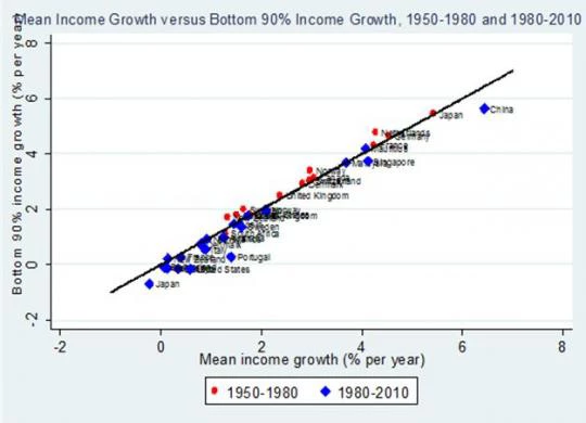
Most of the red-coloured dots fall above the 45-degree line, while the blue dots fall below, indicating that increases in inequality have been more pervasive in the past 30 years than in the 30 before that. However, the most striking feature of this graph is that the cross-country differences in average growth performance (the variation along the horizontal axis) are much larger than the gaps between social welfare growth and average income growth (the deviations from the 45-degree line). Take Japan as an example. Between 1950 and 1980, social welfare grew at 5.4% per year, but between 1980 and 2010 social welfare fell at -0.7% per year. Nearly all of this difference in social welfare performance has to do with the fact that Japan’s growth in average incomes was also 5.4% in the first period, but average incomes fell at 0.2% per year in the second period. More generally, annual growth in average incomes ranges from around 0% to 6% percent per year, across the different country-periods included in the graph. On the other hand, average annual growth in the income share of the bottom 90 percent ranges from around -1% to 0.5%.
Overall, the contribution of changes in inequality to growth in social welfare is on average much smaller than the contribution of growth differences across countries. This is true even though the graph is constructed under the strong assumption of extreme inequality aversion. If we construct the same graph, but using less extreme assumptions about inequality aversion, the data points in the graph move even closer to the 45-degree line. For example if a=1, growth in inequality ranges from -0.7% to 0.4% per year, while for a=0.5, growth in inequality varies between -0.4% and 0.3% per year.
In a new working paper, “Growth, Inequality, and Social Welfare: Cross-Country Evidence”, David Dollar, Tatjana Kleineberg and I perform similar decompositions of growth in social welfare into growth in average incomes and changes in inequality. We consider a range of different social welfare functions, and use a different dataset covering a much larger set of 117 countries (based on the merger of POVCALNET and data from the Luxembourg Income Study) that reflects inequality throughout the entire income distribution, and not just at the high end. While the data, country sample, and time periods considered are different, the same basic message emerges: cross-country differences in growth in social welfare are mostly attributable to cross-country differences in growth in average incomes, while changes in inequality play a much smaller role.
How much do these trends in inequality at the top end of the income distribution matter? While there are many channels through which inequality may affect economic outcomes, a useful first step is to go back to basics and consider the implication of changes in top income shares for changes in social welfare. Economists have long relied on social welfare functions as tools for describing preferences for how income is distributed across individuals in a society. Roughly speaking, social welfare functions are weighted averages of individuals’ incomes, with weights that reflects societal preferences for equity. A common social welfare function first introduced by Atkinson (1970) is
where Yi and si are the average income and population share of group i, and a>0 is a parameter capturing social preferences for equity. Higher values of a place more weight on lower incomes, and so correspond to greater preferences for equity.
Piketty’s data includes the income shares of the top 90%, 95%, 99%, 99.5% and 99.9% percent for many countries, so this gives us six groups over which to calculate social welfare. While there are many different possible values of a that could be used, a useful starting point is to consider the case of extreme inequality aversion, i.e. a is arbitrarily large. In this case all the weight in the social welfare function is assigned to the poorest group, i.e. the social welfare function reflects only average incomes in the bottom 90% of the income distribution, and discounts entirely the incomes of the richest 10%. This in turn implies that social welfare would be unchanged if all of the income of the top 10 percent were taken away and none of it were redistributed to the bottom 90%. While this is of course unrealistic, it is a useful benchmark because it sets an upper bound on the importance that the social welfare function assigns to inequality at the high end of the income distribution.
Growth in social welfare can be decomposed into growth in average incomes, and growth in a particular measure of inequality – in this case, the income share of the bottom 90%. If the income share of the top 10% is rising, the share of the bottom 90% is falling and social welfare increases more slowly than average incomes. On the other hand, if the income share of the top 10% is falling, the income share of the bottom 90% is increasing and social welfare grows faster than average incomes. The difference between the growth rate of social welfare and the growth rate of average income can be interpreted as the welfare loss (or gain) of rising (or falling) inequality, measured in percentage points of growth in average incomes.
How big are these differences between growth in social welfare and growth in average incomes? The graph below shows growth in social welfare (on the vertical axis), and growth in average incomes (on the horizontal axis). Each point is a country, observed over either 1950-1980 (coloured red) or 1980-2010 (coloured blue), over available years in the Piketty data. Countries above the 45-degree line are cases where inequality has been falling, so that social welfare increases faster than average incomes, while in countries below the 45-degree line, social welfare has been increasing more slowly than average incomes since inequality is increasing. The vertical differences between each data point and the 45-degree line measure the welfare costs/benefits of rising/falling inequality, in percentage points of growth per year.
Most of the red-coloured dots fall above the 45-degree line, while the blue dots fall below, indicating that increases in inequality have been more pervasive in the past 30 years than in the 30 before that. However, the most striking feature of this graph is that the cross-country differences in average growth performance (the variation along the horizontal axis) are much larger than the gaps between social welfare growth and average income growth (the deviations from the 45-degree line). Take Japan as an example. Between 1950 and 1980, social welfare grew at 5.4% per year, but between 1980 and 2010 social welfare fell at -0.7% per year. Nearly all of this difference in social welfare performance has to do with the fact that Japan’s growth in average incomes was also 5.4% in the first period, but average incomes fell at 0.2% per year in the second period. More generally, annual growth in average incomes ranges from around 0% to 6% percent per year, across the different country-periods included in the graph. On the other hand, average annual growth in the income share of the bottom 90 percent ranges from around -1% to 0.5%.
Overall, the contribution of changes in inequality to growth in social welfare is on average much smaller than the contribution of growth differences across countries. This is true even though the graph is constructed under the strong assumption of extreme inequality aversion. If we construct the same graph, but using less extreme assumptions about inequality aversion, the data points in the graph move even closer to the 45-degree line. For example if a=1, growth in inequality ranges from -0.7% to 0.4% per year, while for a=0.5, growth in inequality varies between -0.4% and 0.3% per year.
In a new working paper, “Growth, Inequality, and Social Welfare: Cross-Country Evidence”, David Dollar, Tatjana Kleineberg and I perform similar decompositions of growth in social welfare into growth in average incomes and changes in inequality. We consider a range of different social welfare functions, and use a different dataset covering a much larger set of 117 countries (based on the merger of POVCALNET and data from the Luxembourg Income Study) that reflects inequality throughout the entire income distribution, and not just at the high end. While the data, country sample, and time periods considered are different, the same basic message emerges: cross-country differences in growth in social welfare are mostly attributable to cross-country differences in growth in average incomes, while changes in inequality play a much smaller role.

Join the Conversation