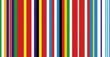
If anyone can gussy up the image of the European Union, surely it is the Dutch architect and theorist Rem Koolhaas. He's the craziest man in Rotterdam. Twenty-six years ago, Koolhaas published one of the best books about New York. His "retro-active manifesto for Manhattan" Delirious New York, is a hymn to excess, hubris and gargantuan spectacle, rediscovering Manhattan's capitalist architects in the first half of the 20th century not just as ruthless space-grabbers but as creative inventors of a science fiction utopia that conjoined, alchemically, Le Corbusier and Salvador Dali.
New York was New Amsterdam once, and Koolhaas's admiration for the Rockefeller Center and Radio City Music Hall manifested itself in a desire to make Europe more American - architecturally at least - without sacrificing Dutch social democratic ideals. What is wrong with prolific urbanism? What's wrong with the Chrysler Building? Koolhaas wanted to give public, community-minded architecture the glamour of the Empire State.
Koolhaas's fame, enhanced by his later book S, M, L, XL, has since won him commissions for Prada and the like. But his proposals for a redesigned European flag and visual identity, to mark the Dutch presi dency of the EU, are a return to his witty, idealistic desire to give worthy European causes the panache of Manhattan circa 1940. Only, it's an uphill struggle. The EU's dullness seems unavoidable, even necessary. With so many European populations suspicious of everything it does, being boring is probably its best option. Better a drab bureaucracy than a colossal superstate.
Personally, I wish Koolhaas had applied his manifesto for bigness in this context, and argued through his designs that colossal is good: he might have praised the sublimity of the European superstate. However, his designs are neatly clever, acceptable, surely, to all member states, and some could plausibly be adopted as flags or stamps. Actually, I've seen more outrageous stamps.
The man who once thought Europeans should learn from the US now knows which side of the transatlantic rift he is on. One of his flags turns the McDonald's M on its side to create a European E. Another scotches the slur of Old Europe by celebrating a modern European icon, Matisse. All of these are nice rebrandings but none exactly epitomise the mega-realities Koolhaas embraced in his New York book, except perhaps when he synthesises all the member states' flags into a panoramic barcode. Delirious Brussels? Afraid not.
