Skip to content
Tech

It ain’t heavy, it’s my e-reader: a review of the Nook Color

We've put the Nook Color Android e-reader through weeks of testing. At $249, …

Nate Anderson | 126

The power of a first impression

The current obsession with product packaging in the blogosphere can sometimes (okay, many times) border on the pathetic. But there is a reasonable assumption behind all the geek package porn: any company that cares enough to craft beautiful, functional packaging has probably given some real attention to the product itself. Refined packaging hints at a refined user experience.

Barnes & Noble has learned this lesson well. Its new NOOKcolor e-reader—which I will henceforth refer to as the "Nook" out of protest at this absurd abuse of the alphabet—comes beautifully packaged in an elongated white cardboard box. When I pulled mine out of its shipping carton, I was immediately impressed and then doubly surprised when the box's bottom popped open on a paper hinge to reveal the Nook inside without requiring me to unlatch, unhook, or cut anything.

The Nook's box appears to contain four magnets: two to hold the hinged lower section closed and another two to hold the hinged section open (when swung back, it attaches to the back of the box with a satisfying thump). I've opened a lot of gadget boxes in my day, and I have to confess a goofy enjoyment at opening such an gloriously over-engineered box; I must have swiveled that hinge open and closed a dozen times before even turning to the hardware within.

The NOOKcolor box

Ars Video


Would the Nook itself live up to its packaging? To find out, I've been living with the device for several weeks and even carted it home for Thanksgiving to allow assorted aunts, uncles, and siblings to bang away on it. The device's strengths and weaknesses can perhaps best be summed up by two brief exchanges with my Kindle-using brother.
ME (upon handing over the Nook): So what's the very first thing you notice?

HIM: It's heavy.

Two hours later, after ignoring the built-in apps and the e-book content to surf the Web on the Nook's 7-inch screen:

HIM: How much did you say this was?

ME: $249

HIM: Hmm. This could be useful.

Indeed, it's the best deal you're going to get right now for a good 7-inch Android tablet (bad ones of course can be had for less)—but that doesn't mean it's without a host of flaws. None of these are fatal, and few are really serious, but together they take some of the shine off a quite tempting apple.

Carry that weight

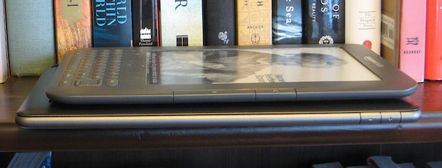
The Nook is heavy in the hand. That was my first impression, and it's one that was reinforced every time I used the device. Though the new Nook is about the same height and width as the Kindle 3, it weighs substantially more, and switching back to the Kindle was like switching from a "desktop replacement" notebook of yore to a MacBook Air. (The Nook is still not nearly as heavy as the iPad.)

Here's a weight comparison between the Nook Color, Kindle 3 (WiFi), and iPad (WiFi):

Kindle: 241g (8.5oz)

Nook: 422g (14.88oz)

iPad: 680g (23.98oz)

The weight certainly isn't a deal-breaker—plenty of people read books on an iPad, for instance—but extended Web surfing might be more comfortable when the Nook rests on a table or in your hand. Holding the device upright in front of your face, especially with one hand, isn't fun for long sessions.

Size difference between a Kindle 3 and the Nook Color

As for appearance, this is notably subjective. The Nook's design is attractive, though it's executed in two tones of grey plastic with a black rubberized backing. Both the top and bottom have rounded edges that give the device something of a "puffy" impression, and the less said about the "iconic" open hook at the bottom-left, the better.

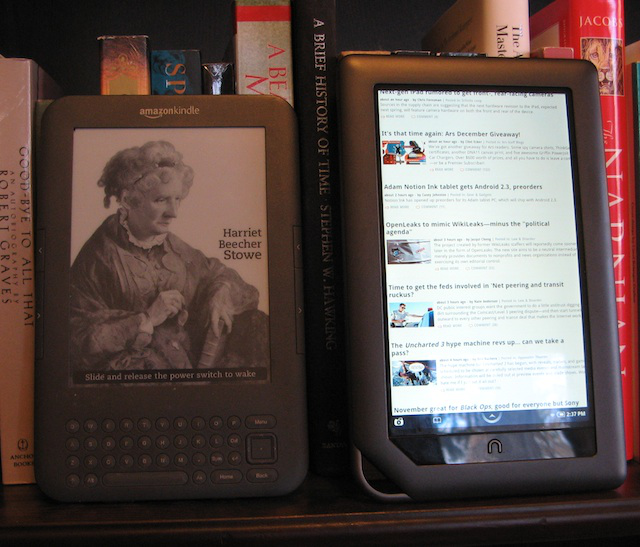
Guess which one is backlit and which is not?

Still, if you're coming from an e-Ink device like a Kindle or a Sony Reader, turning on the Nook will instantly remind you why it's much heavier and a bit bulkier: it has a beautiful color touchscreen. Swiping across the bottom of the screen to unlock the device, then navigating the setup menus and entering a WiFi password, and finally tapping a book to read (with no page-turn lag)—it's all so quick and easy that you'll want to curse the five-way controller, DOS-style text interface, and overall sluggishness of something like the Kindle.

The hardware

Powering this experience is TI OMAP 3621 processor running at 800MHz, with 8GB of flash memory and 32GB more available via a microSDHC card. The 600x1024 pixel screen has a 169 pixel-per-inch density and a full 16 million color range, and WiFi b/g/n provides connectivity (there is no 3G radio).

As for external buttons or ports, they're few: a power button, a micro-USB connector, two volume buttons, and a headphone jack. There's also the "Nook button" on the device face. This looks more like an upside-down U than the lower-case N it is meant to resemble. I found it ugly. Your mileage may vary.

Two small things about the hardware, one good and one bad, that don't show up on the spec sheet: first, the device's tiny mono speaker is not located in the front or even in the bottom of the device, but is fully on the back. The predictable result is that it sounds absolutely atrocious; even system notifications sound like they're coming from another device several feet away instead of from the one in your hands. And if you're listening to music, the headphone jack is a must.

On the flip side, the Nook thankfully eschews proprietary computer interfaces and presents itself over USB as a USB Mass Storage device. Navigating the directory structure is simple and the folders have obvious names. We found it easy to get content, such as pictures and screenshots, on and off the device.

The power of touch

My e-book reading to date has largely been done on the Kindle, which has a terrific e-Ink screen but a slow interface. Want to navigate the menus? Be prepared to click around. Want to read that book in the middle of your home page? Start clicking. Want to highlight text? You guessed it. After a while, this sort of thing grows tiresome, especially with e-Ink's pokey screen refreshes.

The Nook immediately reminds you of the advantages of a touchscreen tablet. Accessing the Web doesn't require a visit to the home screen followed by a trawl through the menu hierarchy—two quick taps and you're staring at full-color webpages. Entering passwords or searching for books on the software keyboard was easily superior to the Kindle's tiny hardware keys, and changing settings or flipping through a list of books is a breeze.

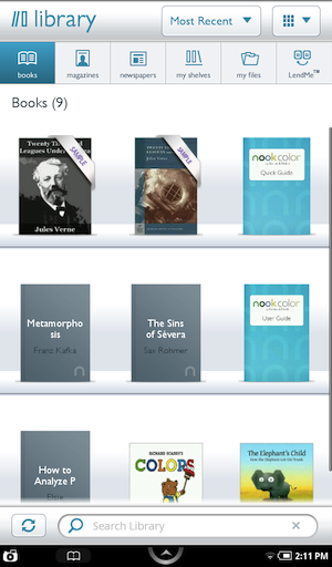
The library

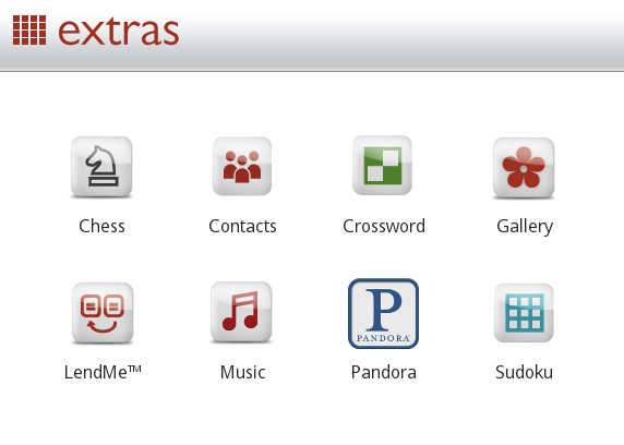
The contrast is most noticeable not in the reading experience, but when using the Web browser and the built-in apps (Nook comes with a music player, Pandora, a photo gallery, chess, crossword puzzles, sudoku, and a contacts program). The Kindle has apps, too—and most are a mess. I would rather superglue my fingers together than attempt to play an entire game of Minesweeper on a Kindle using nothing but the five-way controller.

Similarly, the less said about the Kindle's Web browser, the better. While it shows a competent grayscale rendering of webpages using a WebKit-based engine, zooming in and clicking on links is the sort of torture that should be reserved only for spammers.

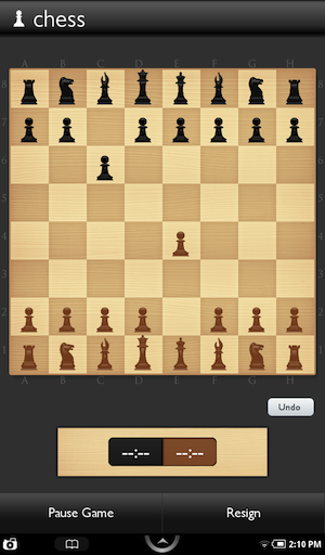
If you want your "e-book reader" to do more than read e-books (and many people don't), just make sure you're aware how much more powerful a color touchscreen can be. Tapping on links, touching chess pieces, logging into and controlling your Pandora account—it's a terrific experience on the Nook.

The included extras

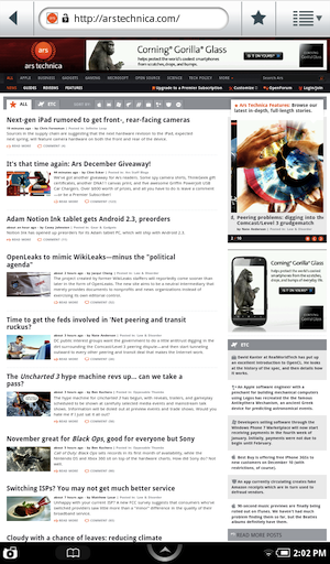
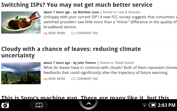
The "extra" Nook programs are put into two categories, clearly indicating their relative importance: there's "Web" and then "Extras." The Nook's browser is terrific at rendering, and it supports Javascript, pop-up blocking, "tabs" (though they aren't actually tabs), and plugins. When it comes to privacy settings alone, the browser can clear its cache, clear cookies, remember form data, and allow location data; this is a full-featured program. It can even handle downloads, which are then made available in the "My Downloads" section of the main Nook library.

In general, the browser was a pleasure to use, and sites looked terrific on the screen. If you've found a smartphone screen just a bit too small to be useful for browsing the "real" Web (as opposed to sites formatted for mobile devices), give a 7-inch tablet a try. The devices are just large enough to do comfortable browsing of even complex sites like The New York Times.

The built-in browser
Google Docs works just fine

But there are some issues. At this screen size, you'll still want to do plenty of zooming to navigate pages and then view content—but the Nook makes this much harder than it needs to be. Some of this may be patent-related; the Nook doesn't do pinch-to-zoom, for instance, a recurring source of frustration when I was trying to size webpages to the screen.

Unfortunately, the Nook's automatic zooming routinely miscalculates the bits of the page I want to see. Double-tap on text and the Nook zooms in—but too often it cuts off a bit of column text or doesn't zoom in far enough. Without the ease of pinch-to-zoom to correct this, you're left with tapping the screen to call up + and - buttons, and then tapping these to position the screen by hand.

This sort of thing happens too frequently

One other small issue afflicts the browser (and other areas, such as PDF viewing): scrolling on the Nook just isn't as smooth as it should be. The device gives the distinct impression—especially noticeable when flick-scrolling quickly through a long page—that some part of its hardware is constrained. Scroll is routinely choppy, and it gets worse on sites like Google Maps, which renders correctly, but is essentially unusable.

Apps! (Sort of)

Chess

Nook runs on a standard Android 2.1 OS, which might make it seem like a terrific deal at $249. Angry Birds! E-mail! Skype! Instant messaging! Perhaps I'll upgrade to Froyo?

Well—no, no, no, no, and yes (but only if you're insane). The Nook is an Android tablet, but it's locked down hard. Barnes & Noble has taken control of the app store process, and will make additional apps available starting in 2011 through its own site. Migrating regular Android apps should be simple, but it's not clear that Barnes & Noble will approve most of them. The company has promised an Android 2.2 update for the Nook, likely early in 2011.

Barnes & Noble doesn't want to sell a general tablet that just happens to run an e-reader app; it wants to sell an e-reader with some additional reading-related functionality. (For everything else, you'll have to access it through the Web, and without Flash.)

The company has already released its SDK to developers, and it outlined the sorts of apps it would accept last month. They fall under three categories:

  • Enrich book content with reference material, audio, photos, videos, Web links, plug-ins, and more to help readers get more out of their books.
  • Extend book content with applications from cooking to travel to science and nature, helping readers further explore their interests.
  • Expand beyond reading with word games, puzzles, and more when it’s time to take a break from a favorite book or magazine.

As a set of criteria, this is pretty nebulous. We'll learn more about the company's strategy early next year, when developers can finally start selling their new apps, but it's clear that the Nook is not meant as a general-purpose Android tablet. (Nook developer docs suggest that reference works, how-to guides, learning apps, and travel, cooking, or history content are all good fits. So is a "book club organizer.")

The Pandora app

In some ways, that's too bad; included apps like Pandora look great, work well, and can run in the background. Artificial limits on the device's functionality hardly seem like the best strategy to encourage widespread adoption, though limiting the apps might let some hyper-connected users feel better about handling a Nook. There's little temptation to do anything work-ish at the moment.

No conversion needed

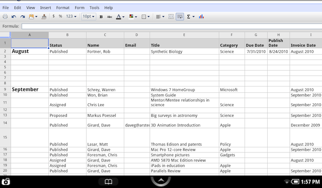
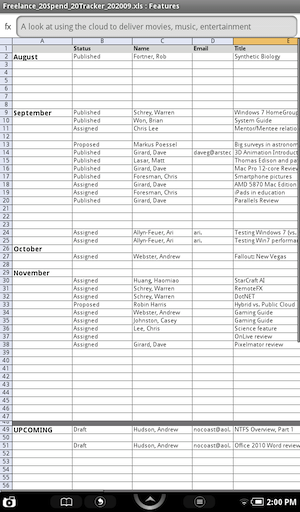
The included apps are fine, if underwhelming (with the exception of Pandora, which is simple but terrific). But the Nook also includes a program that doesn't show up on any menu—an Android version of Quickoffice. Quickoffice can handle most Microsoft Office documents, though this version is display-only; don't count on making changes to that spreadsheet.

But the program works well and does mean that you can at least browse Word documents or look over spreadsheet attachments downloaded from a webmail client. (Exporting a Google Docs spreadsheet also worked well.)

This may not be of much interest to most readers, but those who do need Office access will find this approach much more compelling than the one taken by Amazon—e-mail your documents to a free conversion service, after which they will appear on the Kindle. Not only does Quickoffice support many more filetypes, but it lets you open files downloaded from the device's browser with minimal pain. It's a nice touch.

A spreadsheet in Quickoffice

Reading

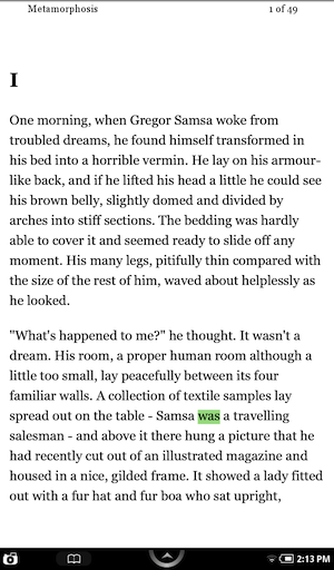
About the e-book reading experience itself, so central to a tablet like the Nook, there's not much to say beyond the fact that it works well and keeps the interface out of the user's way. Tap the right third of the screen or swipe from right-to-left anywhere on the screen and the Nook advances to the next page; reversing the gestures backs up a page. (There are no hardware page turn buttons.) Just watch out for tapping in the center of the screen, which brings up a set of formatting and reading options along the bottom edge.

The basic e-reading screen

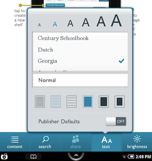
Changing fonts and line spacing is faster than on the Kindle, thanks again to the touchscreen, and Nook comes with a few more built-in fonts than Kindle. Nook also has a nice "scrubber" that you can touch and drag to move through any book.

Text options

As for the reading experience on the two devices, it really comes down to circumstances and personal preference. I read Kafka's "The Metamorphosis" on the Nook in two sittings with no eyestrain and without the need for additional lighting that the Kindle's unlit screen often demands. Still, the text is quite obviously produced on a glowing LCD screen and looks nothing at all like an e-Ink device. Given adequate lighting, I prefer e-Ink for basic reading; in a dark environment, the Nook works much better.

Thanks to its larger screen, Nook handles PDF files a bit better than Kindle, but neither device provides a compelling experience. Both make it difficult to size a PDF page precisely to the screen (you will often want to have the text run from edge to edge with little to no margin around the outer edge of the page). And Nook forces you to scroll through PDFs vertically; no one-top page turns here. Three pages into a 30 page PDF of an academic paper, I ditched the Nook and printed the document instead. Although printed with two pages of text on each physical sheet of paper, the printout provided a far superior reading experience.

Thankfully, the Nook does support ePub, the emerging standard for e-books (Kindle does not), and its annotations and highlighting are superior to the Kindle's, both visually and in ease of use.

Interface issues

The reading experience is fine, but navigation on the Nook is a bit of a mess at the moment. While options are quick to access, they routinely require too much thought. For weeks after the device arrived, I found myself having to pause before trying to execute a command—where would I have to press to bring up the proper option?

When reading an e-book, for instance, the problems are most on display. Initially, you stare a screen of text, devoid of commands or options. So how do you access the various menu icons? By tapping, all over the place.

Tapping the physical Nook button below the screen takes you to a set of three customizable screens in which you can arrange your current reading material. Tapping the small "up arrow" at the bottom center of the screen brings up a menu for navigating the device, switching to the browser or to your library or to settings. Tapping the battery icon in the lower right brings up a centered onscreen menu for changing the wireless settings and screen brightness and orientation. Tapping in the center of the reading material brings up a separate reading menu (which appears in the same place as the navigation menu) to change fonts, adjust spacing, or navigate through the text. Tapping and holding highlights the current word and brings up a four onscreen icons, sitting on some kind of virtual shelf, to allow for highlighting and word lookups. Tapping a highlighted section brings up yet another menu, without icons, for adjusting the highlights. You can see the many different ways to call up options from a single screen by watching the video below:

Interface issues

These approaches are confusing and visually inconsistent; indeed, almost every menu looks different from every other menu, in color, location, and use of icons. You'll get the hang of it over time, but the learning curve here is steeper than it has to be, and it takes far too long to hit the menu you want without having to think.

Use cases

If e-book readers have done one thing for me above all else, it's getting me to read some terrific public domain books. In the last two weeks, I've been plowing through The Education of Henry Adams, Thoreau's wonderfully over-the-top essay on "Walking," Kafka's "Metamorphosis," Byron's Don Juan, and a late Victorian translation/abridgment of The Arabian Nights. I wouldn't have read these on a computer screen, I wouldn't have printed them out, and I wouldn't have bothered to purchase them—but I'm enjoying each of them tremendously.

This week, while reading on my Kindle, I wanted to show my wife a passage from one of these books, but it wasn't one I had marked at the time. I was in the middle of the story and needed to jump back to the preface, after which I wanted to jump back to my place. This can be a bit of a hassle on the Kindle—you have to note your current location, hit the menu button, select "go to," then jump to the beginning of the book or the table of contents, then page slowly through the preface, find the text, read aloud to wife, and then get back to your start point. (Setting a bookmark makes the return trip slightly faster.) It was enough of a hassle that I didn't bother, and it didn't feel much like flipping through the pages of a real book.

On the Nook, by contrast, you bring up the reading menu and then scrub back to the preface with a flick of the finger. Pages turn much, much faster than Kindle, making it easy to skim towards the section you want. When done, you scrub forward again to find your location, stopping on the proper page. It's easier, and it's "bookier."

This seems to me as good a summary as any of the differences between the Nook and Kindle. The Nook's touchscreen and use of color can make it simple to use (when it's not being thwarted by its own interface issues), while doing anything but reading straight through a Kindle book can feel more laborious.

And yet—I was reading the Kindle book. Why? It's noticeably lighter and I like the screen better—when I have enough light. And the battery goes forever.

But this largely depends on how you use each device, and if you want a small Web tablet, the Nook is obviously superior. (It also has advantages if, say, you like to subscribe to digital magazines that feature plenty of photography, or if you purchase children's books.)

The Nook Color is a nice first effort at an Android tablet from Barnes & Noble, though it would benefit from cutting back on the Christmas cookies. It has the potential to become more valuable still with a well-curated app store in the new year, but hints from Barnes & Noble have suggested that we're likely to get things like reading-related cooking apps (which pair, conceptually at least, with cookbooks) rather than the sorts of tools that would give the Nook broader appeal.

Photo of Nate Anderson
Nate Anderson Deputy Editor
Nate is the deputy editor at Ars Technica. His most recent book is In Emergency, Break Glass: What Nietzsche Can Teach Us About Joyful Living in a Tech-Saturated World, which is much funnier than it sounds.
126 Comments